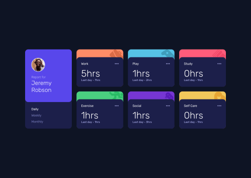
Submitted about 4 years agoA solution to the Time tracking dashboard challenge
Time Tracking Dashboard w/ Tailwind, Webpack, PostCSS and json-server
tailwind-css, webpack, sass/scss
@xs30snw

Solution retrospective
I didn't know how to make a semantically proper switch between 'daily', 'weekly' and 'monthly' data.
On one hand, it should be a navigation block, in which links are organized inside a list. But the challenge also has the feel of an app, where these buttons should rather be radio buttons.
How would you implement this?
Code
Loading...
Please log in to post a comment
Log in with GitHubCommunity feedback
No feedback yet. Be the first to give feedback on xs30snw's solution.
Join our Discord community
Join thousands of Frontend Mentor community members taking the challenges, sharing resources, helping each other, and chatting about all things front-end!
Join our Discord