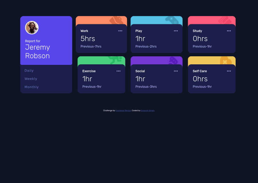
Design comparison
Solution retrospective
It was a fun challenge but took me a lot time than thought to complete this challenge.
Love to have your feedback and suggestions on the code and design. really appreciated.
Community feedback
- @pikapikamartPosted about 3 years ago
Hey, awesome work on this one. Layout in desktop looks great, it is responsive as well and the mobile state looks really great.
Some suggestions would be:
- In here, since you are using
margin
to position themain
centered but it is not consistent. Instead, you can remove themargin
on themain
and add these on thebody
:
align-items: center; display: flex; flex-direction: column; justify-content: center; min-height: 100vh;
This way, even if the user has different resolution on monitor, the layout will always be properly centered.
- On this one, I would prefer a markup that an element will nest the whole 6 card since it is a section of profile-basis-information. This way, the elements are contained properly.
- Person's
img
should be using the person's name as thealt
likealt="Emily R"
. A component like this when a person's name and image are both present, use the person's name as the value as it is a meaningful image. - When wrapping a text-content do not just use
div, b, span
to wrap it, use meaningful element like ap
tag if it just a regular text or heading tag if it is an heading.
Also, I hate to do this but I am going to paste again a comment that I made on this same challenge that I reviewed a while ago, please don't hate me for this haha:
-
For the selections, since you made use of
button
it would be great to nest them inside aul
since those are "list" of selections and user will have an extra information on how many selections are there in the list. Also it would be great to nest that component inside asection
with a screen-reader only heading tag that describes what is that section is all about. Lastly, anaria-live
element that announces the changes or announces the selection has been selected, sincebutton
only does not give extra information. -
Each box/card title like
work
should be a heading tag since it gives information on what the section will contain. -
3 dots could use an extra
aria-hidden="true"
so that it will be totally hidden.
Aside from those, great job again on this one.
Marked as helpful0@soransh-singhPosted about 3 years ago@pikamart ... Hey, thanks this is really helpful,
I should had used
ul
for buttons.If you have any resource on accessibility please share. I want to use accessibility tags but I am really not familiar with them and don't know how to use them properly.
Around device width 600px the layout doesn't look proper so please feel free to give suggestions.
0 - In here, since you are using
Please log in to post a comment
Log in with GitHubJoin our Discord community
Join thousands of Frontend Mentor community members taking the challenges, sharing resources, helping each other, and chatting about all things front-end!
Join our Discord