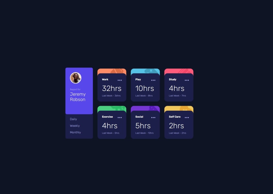
Design comparison
Solution retrospective
Most proud of using javascript to dynamically update the data. Also felt much more comfortable with flex and grid, and lastly felt better about trying to get the design, nearly correct.
What challenges did you encounter, and how did you overcome them?The main one was just debugging the javascript. Nothing too complex, but just figuring out how to dynamically add and remove HTML elements.
What specific areas of your project would you like help with?Perhaps my CSS styling, specifically transitioning between mobile and desktop designs with grid.
Community feedback
- P@danielmrz-devPosted 10 months ago
Hello there!
Congrats on completing the challenge! ✅
Your solution looks great!
I have a suggestion for improvement:
📌 Think about using
<main>to wrap your main content instead of<div>.Imagine
<div>and<span>in HTML as basic containers. They're good for holding stuff, but they don't tell us much about what's inside or its purpose on the webpage.This change might not have impact on how your page looks, but it'll make your HTML code clearer and help with SEO and accessibility.
Hope that's helpful!
Keep up the great work!
0
Please log in to post a comment
Log in with GitHubJoin our Discord community
Join thousands of Frontend Mentor community members taking the challenges, sharing resources, helping each other, and chatting about all things front-end!
Join our Discord
