Submitted almost 3 years agoA solution to the Time tracking dashboard challenge
Time Tracking Dashboard using Tailwind
tailwind-css, fetch
@hiofadlikaakbar

Solution retrospective
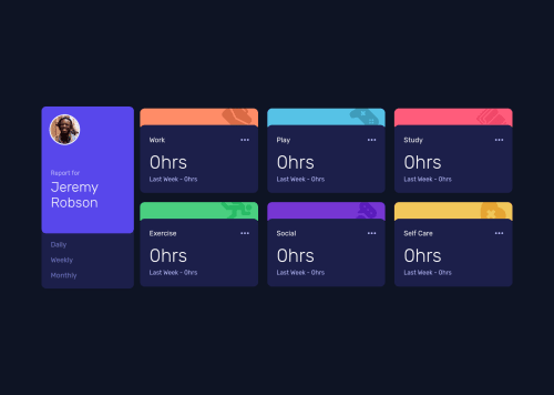
For this challenge, the tricky part is to arrange the box time, this in my opinion is quite tricky because this box must follow the responsiveness on various screen sizes for mobile is quite easy but for tablet and laptop screens it takes precision to arrange the box to follow according to the screen size, I suggest using grid and flex with both it will be more free to arrange the box.
Not good enough but i like it
Feel free to drop any feedback ✌.
Code
Loading...
Please log in to post a comment
Log in with GitHubCommunity feedback
No feedback yet. Be the first to give feedback on Hio Fadlika Akbar's solution.
Join our Discord community
Join thousands of Frontend Mentor community members taking the challenges, sharing resources, helping each other, and chatting about all things front-end!
Join our Discord