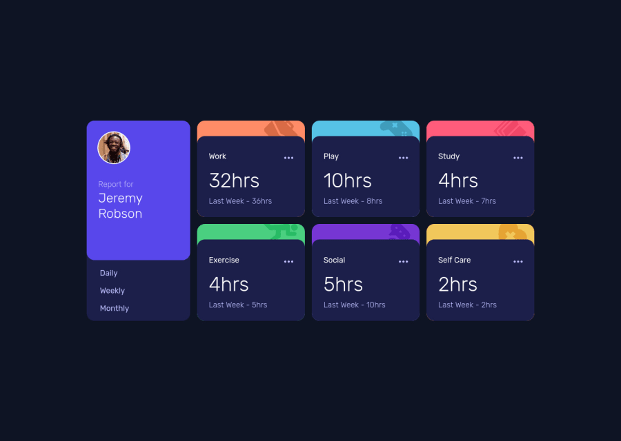
Design comparison
SolutionDesign
Solution retrospective
Hello everyone! ( •̀ ω •́ )✧
Another challenged done~ This one is really hard to finish. I feel like my code isn't that good so if you have any feedback please do let me know!
Thank you~ (≧∇≦)ノ
Community feedback
- @fazzaamiarsoPosted over 2 years ago
Hello Briuwu! Great work! You sure improved a lot!
I just want to give quick tips.
- On your logos array, you better put it above the component. Why? because the array content doesn't depend on any state or props. So, by putting the array above, it prevents React from unnecessarily re-creating the array every time the component re-render.
- On your
onClick, you can just doonClick={handleButton}as the event argument will be automatically passed to the callback function.
I hope it helps! Cheers!
Marked as helpful1@BriuwuPosted over 2 years ago@fazzaamiarso I see, I still get confused about how to properly managed my code so this is really helpful! Thank you~ (≧∇≦)ノ
0 - @Kamasah-DicksonPosted over 2 years ago
Your solution looks great and responsive on smaller devices also.
I don't see any problems with your buttons everything is working.
- Also try to fix the accessibility issue.
Besides good job there👍 Have a nice day👍💻
1
Please log in to post a comment
Log in with GitHubJoin our Discord community
Join thousands of Frontend Mentor community members taking the challenges, sharing resources, helping each other, and chatting about all things front-end!
Join our Discord
