Design comparison
Solution retrospective
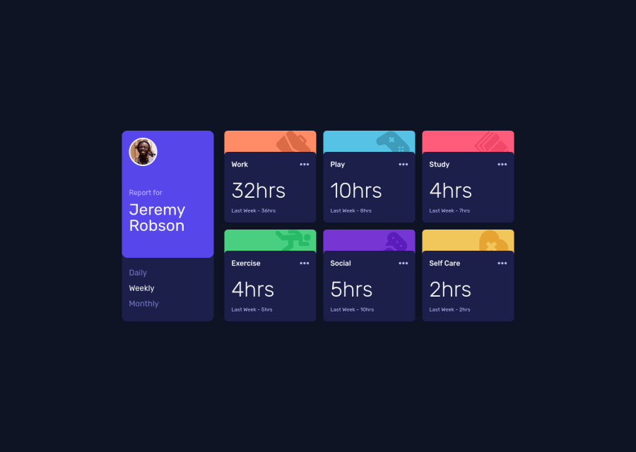
Had a hard time using UseContext with Typescript, so I went back to pure Javascript and it was smooth sailing. I also couldn't find a way to not have the hover effect over the blue background whenever I was hovering over the ellipsis button. Any suggestions on how to do that? Don't hesitate to mention if there are any other problems as well!
Community feedback
- @elaineleungPosted over 2 years ago
Hi Remtaine, about not having the background hover effect when hovering on ellipsis, I think I might have had that in my earlier versions of this challenge, but eventually I felt it was just poor user experience and removed it. Anyway, maybe you can try using a
mouseenterandmouseleaveevent listener that can remove the effect somehow.By the way, this was well done! I think you just need some more padding to make the cards a bit bigger and also the corners a bit rounder, and that should get the component looking closer to the original. One last comment I have is, the "Last Week" label is currently also used for the "daily" and "monthly" timeframes; you may want to change that to the appropriate labels, as in "yesterday" and "last month".
Hope some of this helps you!
Marked as helpful1@remtainePosted over 2 years ago@elaineleung Thank you! I agree that it doesn't feel like good UX, so maybe I'll get rid of that in custom iterations. I'll make the necessary changes to the size and rounding, as well as changing the labels.
0
Please log in to post a comment
Log in with GitHubJoin our Discord community
Join thousands of Frontend Mentor community members taking the challenges, sharing resources, helping each other, and chatting about all things front-end!
Join our Discord
