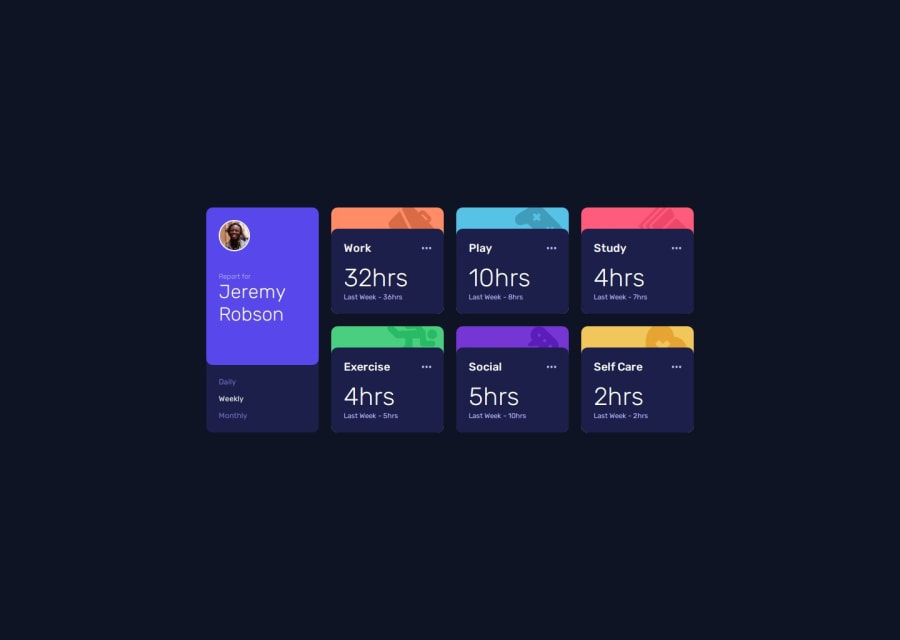
Design comparison
Community feedback
- @psychederikPosted 5 months ago
I love the media query breakpoints you added. Your app looks excellent. Also, your code is so neat and simple. I could learn a lot from studying your code!
One obvious issue is the size of the elements on desktop, they're a bit small but other than that you did a beautiful job. It's hard getting the sizes correct without the Figma files T.T
I downloaded a Windows app called PowerToys. It has a lot of useful tools like a pixel ruler and color picker you can use globally on your PC. Its free and totally worth checking out if you're running Windows. That way you can measure the design images and have a better estimate of what size you should make the width/height.
Great job, keep up the good work👍
Marked as helpful0
Please log in to post a comment
Log in with GitHubJoin our Discord community
Join thousands of Frontend Mentor community members taking the challenges, sharing resources, helping each other, and chatting about all things front-end!
Join our Discord
