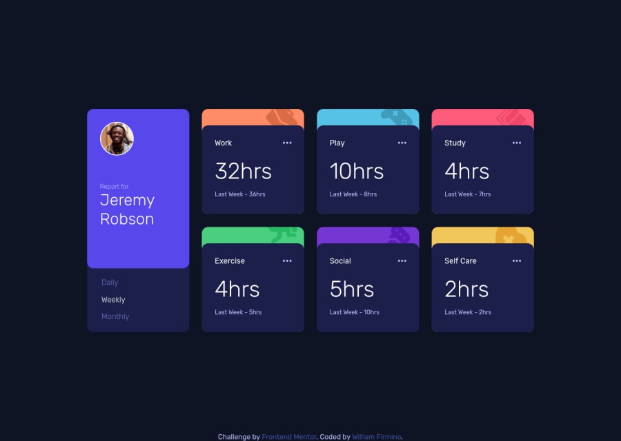
Time Tracking Dashboard using pure HTML, CSS and JS
Design comparison
Solution retrospective
This is my second solution submitted here. I could recap a lot of things building this one and I fell excited moving forward for more challenges. I didn't use mobile-first design principles but I was able to realize some things to start with it in my next project. I haven't used anything but pure HTML, CSS and JavaScript and it made me feel like I could make it faster if I have used frameworks. Perhaps now I can finally start to grow my knowledge about them.
I appreciate feedback on whatever you think is necessary to be improved. Do my tags on HTML need changes to be more accessible? Did I forget something that could make development and maintenance easier? Anything you might think that is useful for me to know, please be free to share. Thanks, in advance.
Community feedback
- @Kerri-AnnBatesPosted almost 3 years ago
I think this looks great! Yes, a JS framework would make the JS code more maintainable and readable, but doing it from scratch the way you did is a great way to solidify your JS foundation before moving on to working with a framework.
I noticed from reading through your JS code on line 26 - 28 that you created class names for the card title by replacing a space with a dash using .replace() method. I know that the json data provided did not have any titles with more than one spaces, but just as a buffer, consider using .replaceAll(). Some titles might have more than one spaces that you would want to replace. Something to think about in the future.
Keep it up!
Marked as helpful1@WillwfPosted almost 3 years ago@Kerri-AnnBates Thank you very much for the feedback. It's very appreciated. I'm gonna implement your tip about the .replaceAll() method, since I found it very useful. I hope that on my next work I'll be able to use frameworks, but sometimes I find very difficult to understand some things, like hooks in React. I guess that it makes all more challenging.
0@Kerri-AnnBatesPosted almost 3 years ago@Willwf You're welcome! And I can totally relate, hooks are confusing, and new technology is difficult to understand but with time, things will start to click the longer you stick with it.
Good luck :)
1
Please log in to post a comment
Log in with GitHubJoin our Discord community
Join thousands of Frontend Mentor community members taking the challenges, sharing resources, helping each other, and chatting about all things front-end!
Join our Discord