

Design comparison

Solution retrospective
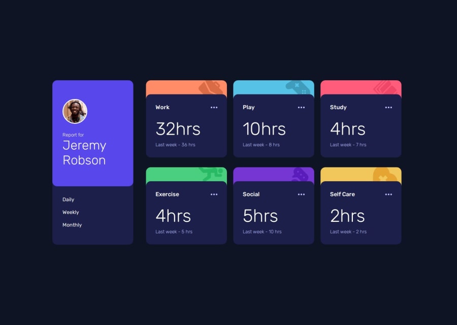
I`d tried to do the logic more using my knowledge and less IA. Im proud of finished what i have started.
What challenges did you encounter, and how did you overcome them?I spend much time trying to do something with flexbox and at the end i could understand how its work. lets go!
Community feedback
- @khatri2002Posted 2 months ago
Hi! The developed solution looks great! Here are a few suggestions to refine it further:
1. Addressing Inconsistent Gaps Between Cards
-
The row gap appears larger than the column gap between the cards.
-
Multiple
flexcontainers are being used to position the cards. -
While
flexboxworks well here, managing gaps and responsiveness can get challenging with complex layouts. -
Consider using CSS Grid for more control over the layout and spacing.
-
With Grid, you can define consistent gaps between rows and columns using the
gapproperty. -
This will ensure uniform spacing and simplify responsive adjustments.
2. Using
buttonfor Clickable Elements- You've used the
lielement for renderingDaily,Weekly, andMonthlyoptions, withonClickhandlers attached. - Since these options perform an action when clicked, using
buttonelements would be more semantically appropriate. - So you can consider using a
buttoninsideli.
You're doing a fantastic job! Keep up the excellent work! 🚀
Marked as helpful1 -

Please log in to post a comment
Log in with GitHubJoin our Discord community
Join thousands of Frontend Mentor community members taking the challenges, sharing resources, helping each other, and chatting about all things front-end!
Join our Discord