Time Tracking Dashboard Using HTML | CSS | JS
Design comparison
Solution retrospective
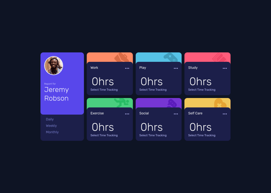
Hi All, Completed this challenge by googling and referring others solutions to workaround and finish it. Any Suggestions to improve my solution will be appreciated
Thanks in Advance.
Community feedback
- @techantherePosted almost 3 years ago
Congratulations on completing another challenge, it's looking great! I have looked into your code and have few suggestions:
-
"Report for Jeremy Robson" should all be enclosed by a h1 and each title should be an h2.
-
There must be a way to tell the user which button is active, i.e. daily, weekly or monthly stats, at the moment. You can use aria-expanded or aria-selected on button.
-
Add some active and hover states on button to make them standout when any of them is selected, you can use
aria-selected="true"on the button which is active and then apply the color using the selector like this[aria-selected=true]{ color: #fff; } -
I have tested your solution on smaller heights, you should add some vertical padding on the body as well.
-
As it can be seen on the initial loading of page, the static data of 0hrs is shown, which doesn't really look nice, you can use a function to load the data on window.onload or something similar in Javascript and keep one button active on loading.
-
Check the accessibility report and try to correct all the mistakes, it will really help you do things semantically well.
Good luck!
Marked as helpful0 -
Please log in to post a comment
Log in with GitHubJoin our Discord community
Join thousands of Frontend Mentor community members taking the challenges, sharing resources, helping each other, and chatting about all things front-end!
Join our Discord
