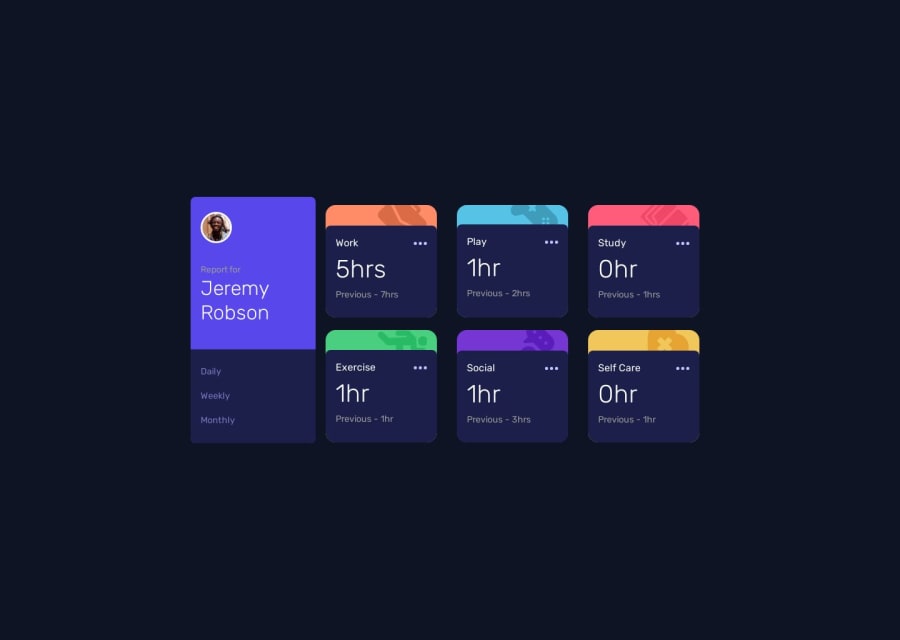
Time Tracking Dashboard using HTML, CSS and vanilla Javascript
Design comparison
Solution retrospective
Hello Frontend Mentor Community !
I finished yet a new challenge with the Time Tracking Dashboard. It wasn't as easy as I thought it would be. I still had difficulties with the responsive part. I started by taking a mobile-first approach, and I didn't had too much difficulties. But when I had to make the tablet/desktop part, it was quite a nightmare. I succeeded in the end, but I feel like I have to learn specific part of CSS I'm not really at ease with ! It took me a good amount of time, like half of my afternoon, which I feel was quite a lot. But it was worth the challenge, I learned along the way.
As usual, if you have any feedback about my code, feel free to say what I can improve !
Community feedback
Please log in to post a comment
Log in with GitHubJoin our Discord community
Join thousands of Frontend Mentor community members taking the challenges, sharing resources, helping each other, and chatting about all things front-end!
Join our Discord
