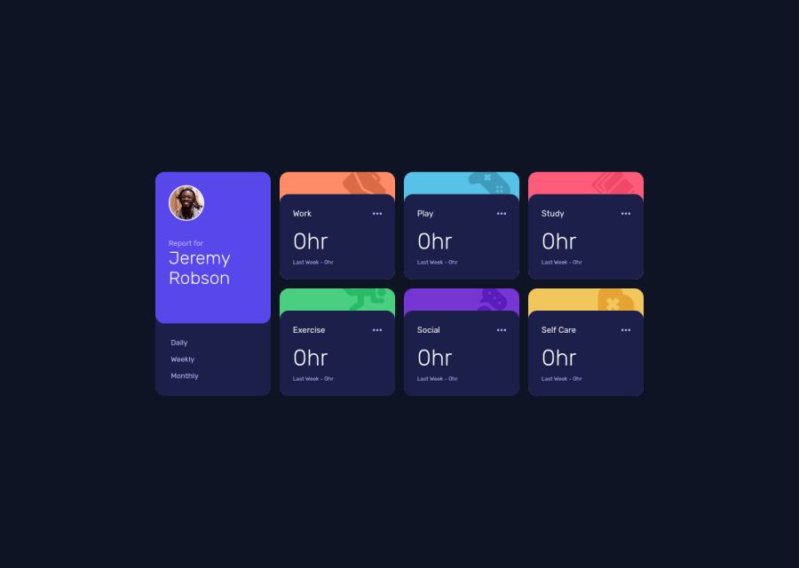
Design comparison
Solution retrospective
I would greatly appreciate your feedback on my project so that I can make improvements. Thank you in advance for taking the time to share your thoughts with me.
Community feedback
- @Remy349Posted over 1 year ago
Hi @Xjanus12x, congratulations for completing the challenge, the truth is that it is a very good result you achieved. I would just like to give you some tips for you to consider for your future projects:
-
Looking at the HTML you wrote I noticed that you used a lot of <figure> tags, for this project I recommend you to use the <article> tag, I leave you this link to learn more about it. You will have a better structure when writing HTML: HTML: <article>
-
This one is for the cards, there is a point where the cards don't fit well in the height, do the test trying to reduce the width of the window and you will see what I am talking about, you can solve this by adding a height to your .card__hours element:
.card__hours {
  min-height: 100%;
}
That should be enough to solve that little problem.
- This tip is for your styles.scss file, use @forward instead of the @import. I leave you this link: SASS @forward
I hope my advice will be helpful. Again congratulations for completing the challenge, excellent result. Keep learning :)
Marked as helpful0 -
Please log in to post a comment
Log in with GitHubJoin our Discord community
Join thousands of Frontend Mentor community members taking the challenges, sharing resources, helping each other, and chatting about all things front-end!
Join our Discord
