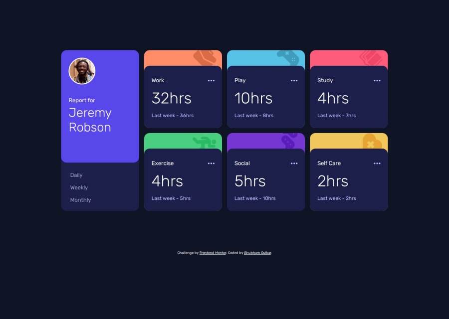
Time tracking dashboard using custom web components and grid
Design comparison
Solution retrospective
I learned MVC low level design architecture. Also I design custom card components with setBackgroundColor() method. Complete page is render dynamically. Spinner for slower connections and error handling functions are written to show errors to the user.
What challenges did you encounter, and how did you overcome them?I used grids and subgrid in this project. It was challenging task to do, but I wrote minimum css thanks to grid. Challenging task was when subgrid element was overlapping main grid element on small screen( checkout
What specific areas of your project would you like help with?I want to know about low level design architectures used in frontend development.
Community feedback
- @mbd89Posted 12 months ago
It looks great, I like the animations., you forgot cursor:pointer; on the daily weekly and monthly buttons and the active state when we hover on the cards
0@ShubhamOulkarPosted 12 months agoThank you for remainder @mbd89, I thing I missed these selectors while refactoring CSS code.
0
Please log in to post a comment
Log in with GitHubJoin our Discord community
Join thousands of Frontend Mentor community members taking the challenges, sharing resources, helping each other, and chatting about all things front-end!
Join our Discord
