Design comparison
Solution retrospective
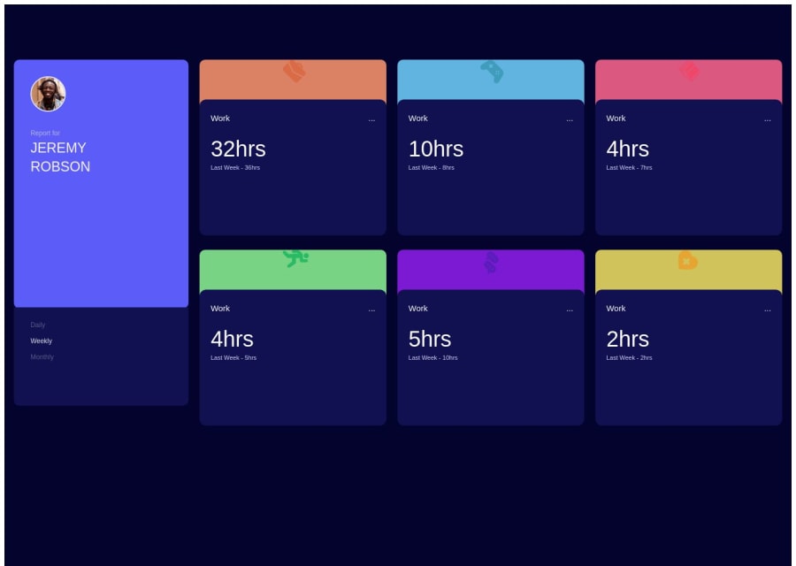
I found it challenging to insert the images in the smaller cards as precisely as they have been placed in the challenge. Can someone enlighten me on how to correct that?
Community feedback
- @Aisdev979Posted about 1 year ago
Check out my code, study them.
What I did was placing the image on the main card the position them on the right while I add position absolute to the card with the time information.
Hope this helps.
Marked as helpful0 - @CarlHummPosted about 1 year ago
Hi there, the solution looks nice
In-regards to the images, you could do the following
- Absolute Positioning
- Flexbox & Margins
- Background Image
For absolute position it's straight forward, you could do something like this.
.topsection { position: relative; } .img { position:absolute; left:60%; bottom:0; transform:scale(1.2); padding-left: 0 <-- remove the padding values on your img container } .bottomsection { position:relative; }
Since you've already set negative margins on the bottom section, the image will be partially hidden. Also, there isn't really any need for img container, we could just have the image and position it using the same styles.
For flexbox and margins you could do something like this
.topsection { display: flex; justify-content:flex-end; align-items:flex-end; } .img { margin-right: 30%; } .bottomsection { position:relative; }
Pretty much the same thing with an extra step, we are aligning the content inside the box to the end and at the bottom, then pushing it away from the right side with a margin.
For Background Image you could do something like this
.topsection { background-image:url('./images/icon-work.svg'); background-repeat: no-repeat; background-size:3.6em; background-position: 65% bottom; }
With this technique, you would remove the image inside top container and set the background for that container as the image URL.
Just a rough idea
Keep in mind these are just examples and the sizing values for the icons are quite different in the actual design. I'm just showing that there are numerous ways to position elements in CSS.
For further reading you could refer to.
0
Please log in to post a comment
Log in with GitHubJoin our Discord community
Join thousands of Frontend Mentor community members taking the challenges, sharing resources, helping each other, and chatting about all things front-end!
Join our Discord