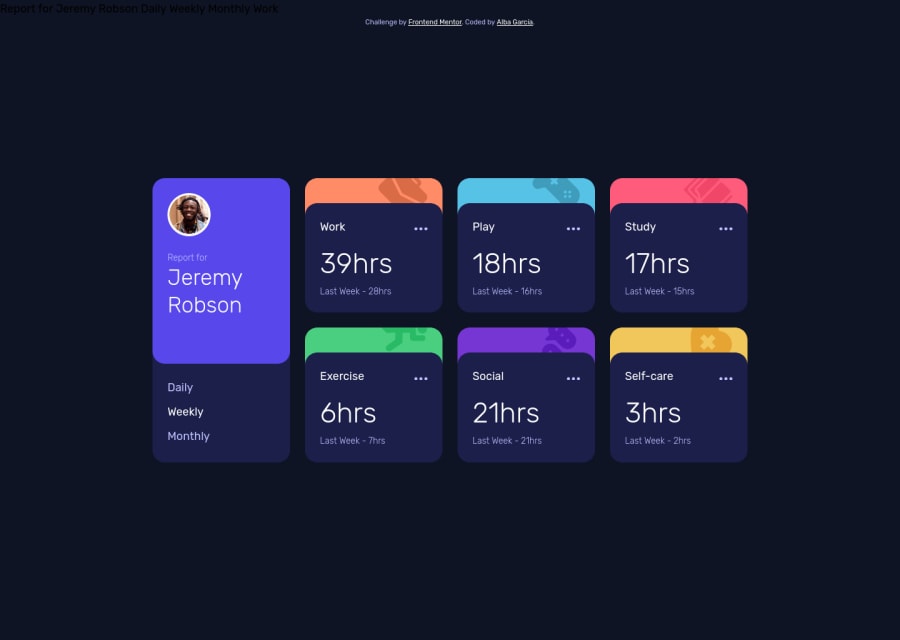
Design comparison
Solution retrospective
I would appreciate any feedback! Please feel free to give constructive criticism!
Community feedback
- @androgitaiPosted about 3 years ago
Hey, looks good I just finished this challenge too:) One thing I noticed the 3 dots hover still hovers the whole card. I had the same issue first but fixed it with the dots in a separate div outside the card div and positioned as absolute to the right place.
Marked as helpful1@koalbaPosted about 3 years ago@androgitai Didn't thought about that! I'll look into it! Thanks! <3
1 - @nmorajdaPosted about 3 years ago
Looks fine but keyboard navigation (Tab, Shift + Tab) is not possible because the navigation menu is a bulleted list. Apply buttons or links and the elements will become available.
Marked as helpful1@koalbaPosted about 3 years ago@nmorajda thank you for the feedback, I really appreciate it! I must admit I didn't know about that, how do you suggest I could fix that?
0@nmorajdaPosted about 3 years ago@koalba Use html tags that are designed to create clickable elements: "button" or "a", and in the js file handle the click event.
Marked as helpful1
Please log in to post a comment
Log in with GitHubJoin our Discord community
Join thousands of Frontend Mentor community members taking the challenges, sharing resources, helping each other, and chatting about all things front-end!
Join our Discord
