Design comparison
Community feedback
- @dylan-dot-cPosted 5 months ago
Well done, everything looking good but there are a few improvements to make.
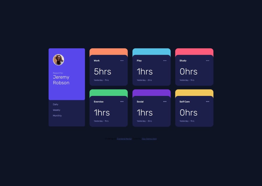
- since the weekly timeframe would be the default one, you need to make sure that it's shown as active onload not just when you click it.
- In a real world solution you would use fetch to get dynamic data, but since in this case it's static you can make it a file and import it.
- You are using fetch everytime a user changes timeframe, it would be better if you get it once, store it globally and just return the data for the timeframe or use it, instead of fetching the file everytime which is unnecessary since it won't really change. In a real world solution, then you would do this from an API but you could check if the data exists first if not fetch it.
- you are not following DRY principles as you are adding colors to active button repeatedly and that could have been done in a function. You could make use of data-attributes in HTML to help make this part easier.
- for mobile, the last duration text should be on the same line as the time.
- you are missing the icons on each section like the game controller, the book and such, you can use css to do that and it will be a good test of your dry principles. After code inspection, you have the classes but you forgot to add them. Also when you might need to adjust the folder structure as it's looking for all the icons to be in an images folder which they are not. You also need to add some extra code to manage the background image in terms of positioning, repeat and maybe something else.
- You could make use of templates to make it more dynamic instead of having to write out all that frame code by hand and what would you do if the list changes to 10 items or so? You would have to carefully change your code to show them.
- folder structure. It can be better, mainly put all images in a images folder and make sure you complete the instructions in readme.md in terms of the template
You did really well and the design looks good.
You can take a look at my solution to see how I did mine and tell me what you think!
1@ChikairoPosted 5 months agoThanks @dylan-dot-c just looked at your code and it's wonderful. Though am having a bit of trouble really understanding Javascript(just started learning it), I would love if you could work me through that part of your code.
1
Please log in to post a comment
Log in with GitHubJoin our Discord community
Join thousands of Frontend Mentor community members taking the challenges, sharing resources, helping each other, and chatting about all things front-end!
Join our Discord
