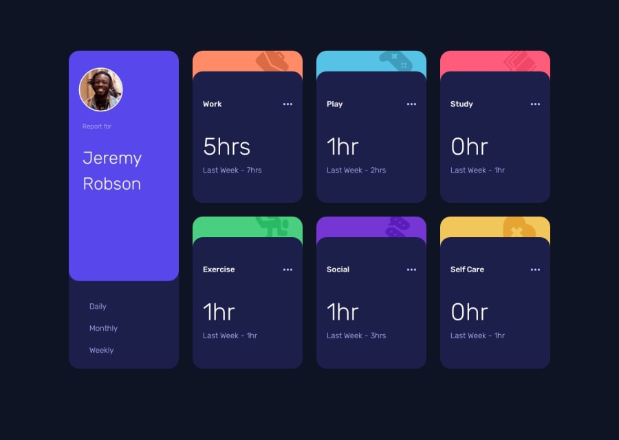
Time tracking dashboard (Sass, CSS filtering)
Design comparison
Solution retrospective
I'm proud that I was able to use CSS in a new way, using it for the filtering of the page. CSS attributes wasn't something I'd worked with before and found it to be a nice solution.
What challenges did you encounter, and how did you overcome them?The main challenge I had was in wanting to build out the cards dynamically while reading from the data.json file, as if I was using a component based framework without using one. I tried to spend a bit of time planning out how I was going to structure everything and wrote it out as html to refer to when writing the javascript. I'm hoping the javascript is clear enough as concise as it can be.
I also built out a working skeleton for the dynamic tile creating, layout and filtering, and this helped me a great deal. Most of the work from there was rewriting it to fit with BEM.
What specific areas of your project would you like help with?Things in particular for feedback that would be greatly appreciated:
- Any feedback on the usage of BEM, I'm still familiarising with it and wanting to make sure I am implementing it using best practise
- Any feedback on the javascript - how it might be cleaner / more reusable
- Any missing accessibility features?
Community feedback
Please log in to post a comment
Log in with GitHubJoin our Discord community
Join thousands of Frontend Mentor community members taking the challenges, sharing resources, helping each other, and chatting about all things front-end!
Join our Discord
