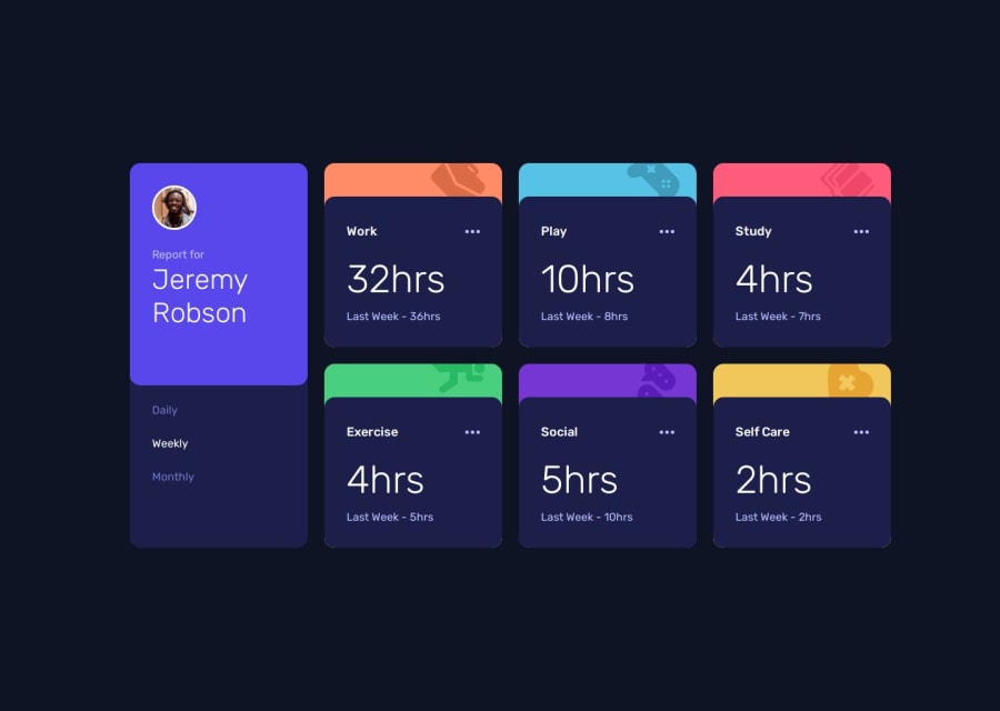
Design comparison
Solution retrospective
My last challenge on here was a bit of a mess in terms of splitting it into components, so I spent a bit more time thinking about how I wanted the CSS to work & decided to split up the profile section and the cards into completely separate components rather than having styles shared between them. I'm also happy with the way I used custom properties to reduce repetition in things like colours and spacing. I'm doing a CSS course alongside this and I haven't got to the section on the Grid layout yet. I have a basic understanding of it, but it just takes me a bit longer to figure it out currently. Once I understand Grid in more detail I am hoping to be a bit more confident with it.
What challenges did you encounter, and how did you overcome them?I didn't complete most of the Javascript stuff, not because I couldn't do it, but I write enough JS at work and it's not really what I'm here for. Much more interested in the CSS!
What specific areas of your project would you like help with?I am always on the lookout for things I could do to make my code more responsive and/or accessible.
Please log in to post a comment
Log in with GitHubCommunity feedback
- @Anmol610989
code is very neat and easy to understand
Join our Discord community
Join thousands of Frontend Mentor community members taking the challenges, sharing resources, helping each other, and chatting about all things front-end!
Join our Discord
