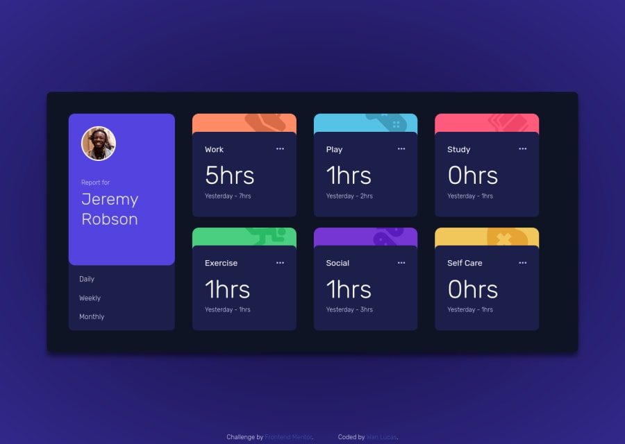
Time tracking dashboard responsive made with flex-box and grid
Design comparison
Solution retrospective
I would like feedbacks about the aparence and the code.
Community feedback
- @jordon-youngPosted almost 3 years ago
Nice job on the desktop design!
I like your transitions. I never thought to move any of the text. Proportions on the cards are great.
My only comments on the desktop design are:
- the grid gap should be the same for rows and columns
- the footer is very difficult to read because of the low text color contrast
I did my solution mobile first because I thought it would be too difficult to responsively minimize everything. Good luck as you finish! Don't be afraid of refactoring code or making a copy of your project and trying mobile first media queries (min-width).
Marked as helpful1 - @shashreesamuelPosted almost 3 years ago
Hey wanlucas, good job completing this challenge. Keep up the good work
Your solution looks great however I think each of the 6 cards needs to be a bit wider to match the design.
Secondly the text on your column card needs to be larger to match the image shown in the design
In terms of your accessibility issues
-
Buttons must have discernible text, you can fix this my mentioning the
aria-labelattribute in the button tag -
Images must have alternative text, simply mention the
altattribute in the image tag.
In terms of your validation errors it will be resolved when the accessibility issues are fixed
I hope this helps
Cheers Happy coding 👍
Marked as helpful1@wanlucasPosted almost 3 years ago@TheCoderGuru Proportions corrected, soon I will correct the rest. Thank you for your help!
0 -
Please log in to post a comment
Log in with GitHubJoin our Discord community
Join thousands of Frontend Mentor community members taking the challenges, sharing resources, helping each other, and chatting about all things front-end!
Join our Discord
