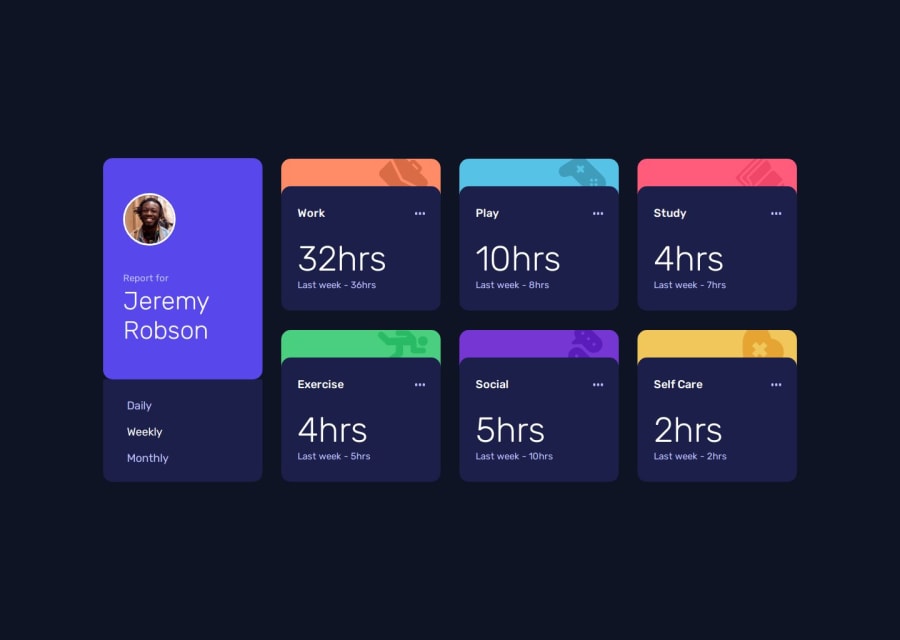


Design comparison
SolutionDesign

Solution retrospective
What are you most proud of, and what would you do differently next time?
I am proud of getting a good lighthouse score on this project.
What challenges did you encounter, and how did you overcome them?One challenge I faced was naming classes and distinguishing between them later while styling.
What specific areas of your project would you like help with?I would be grateful if someone could improve my js. I tried to make the solution as simple as possible.
Community feedback
Please log in to post a comment
Log in with GitHub
Join our Discord community
Join thousands of Frontend Mentor community members taking the challenges, sharing resources, helping each other, and chatting about all things front-end!
Join our Discord