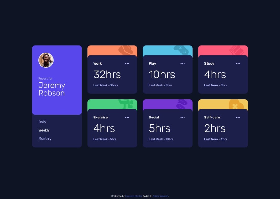
Design comparison
Community feedback
- @KapteynUniversePosted 6 months ago
Hey, nice job.
Changing grid-row from 1/6 to 1/5 in your card__background will solve the little overflow at the bottom edges.
Also pixels are fixed sizes and don't scale well on different devices. Instead, use rem or em, which are relative units that adjust based on user settings, making your design more flexible, responsive, and accessible.
Marked as helpful0P@NikitaVologdinPosted 6 months ago@KapteynUniverse Thank you for pointing out the issues. I fixed them.
0
Please log in to post a comment
Log in with GitHubJoin our Discord community
Join thousands of Frontend Mentor community members taking the challenges, sharing resources, helping each other, and chatting about all things front-end!
Join our Discord
