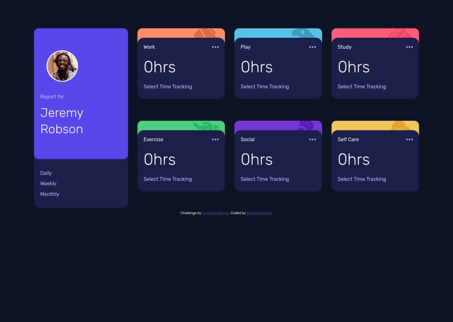
Design comparison
Community feedback
- @PabloodevPosted 3 months ago
ey @Safi200, whats up?
Well, I have some suggestions for you and I hope they help you!
-
You used display flex to style and insert each card in its position, but when entering the live site URL I noticed that there were some cards that were out of place, when looking at the root solution, it is possible to see that an approach with display: grip could give you bring more code clarity.
-
Your CSS reset is covered in comments that I believe are not necessary, one of the topics written in the book "clean code" is to eliminate comments, "they are smelly, delete them", because anyway, we all know intuitively that This is a reset, right?
-
This in this case is not a tip but feedback, I really liked the way you carried out the responsiveness, it was so calm and smooth! Congratulations, maybe this is due to the fact that I use display flex in the card div
-
Document your code, I know it's boring to do code documentation, the README is very cumbersome, but believe me, make it routine after finishing a solution, code documentation is something very important, companies will notice how organized you can be be with your codes!
-
I couldn't figure out why, but the cards are becoming distant when I put them on my second monitor, the card profile is exceeding the screen size, as if something was unfinished
Anyway, it was a great solution, maybe I'll learn from you how to achieve smooth responsiveness, keep coding!
0 -
Please log in to post a comment
Log in with GitHubJoin our Discord community
Join thousands of Frontend Mentor community members taking the challenges, sharing resources, helping each other, and chatting about all things front-end!
Join our Discord
