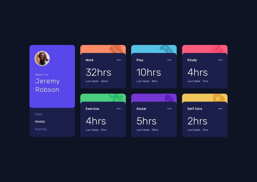
Time tracking dashboard (Next.js + TypeScript + Tailwind CSS + ESLint)
Design comparison
Solution retrospective
Hi there π, Iβm Melvin, and this is my solution for this challenge. π
π Features:
- Tabbed interfaces. π
- Controllable using arrow keys and Tab. β¨οΈ
- Tooltip that allows copying statistics. π
- Resemblance with the original design. π¨
- Progressive Web App (PWA) support. π±π
- Small animations with Framer motion. π¬
- No errors or warnings using ESLint (Airbnb style guide). βοΈ
- Client-side fetching with SWR to simulate an API. π
- Custom hooks. π£
- Tested with the TalkBack screen reader on mobile. π±
π οΈ Built With:
- Nextjs 13.5.4. βοΈ
- TypeScript. π
- TailwindCSS. π¨
- Framer-motion. π¬
- ESLint (Airbnb style guide). π¦
β Question:
Not very proud of the prop drilling in the solution. Any recommendations to avoid it? I've tried using the Context API to reduce it, but I don't see much difference.
Any suggestions on how I can improve and reduce unnecessary code are welcome!
Thank you. πβοΈ
Community feedback
- @alihydroPosted about 1 year ago
Excellent solution. Really impressive ππ.
2@MelvinAguilarPosted about 1 year agoThank you so much! @alihydro. Your positive feedback is greatly appreciated! ππ
1 - @javascriptor1Posted about 1 year ago
Hi MELVIN ,
Excellent solution. Really impressive ππ.
The only issue I noticed is the background color for the 6 main cards is visible on the bottom corners (right & left).
Take for example the work card. If you notice the bottom corners from right and left, you will see orange colors from the background. It's very slight though, merely noticed by eyes.
Your solution is perfect indeed. I hope if you have free time to share with us in a writeup how you can produce an exact pixel-perfect solution in such a remarkable way.
Thank you so much.
2@MelvinAguilarPosted about 1 year agoHello! @javascriptor1
Thank you for your keen observation and feedback. Indeed, during the development process, I observed that slight background color discrepancy on the work card's bottom corners. It was subtle enough that I overlooked rectifying it. I'll ensure this is addressed promptly.
Regarding my workflow, I begin by crafting the HTML structure and prioritize addressing accessibility concerns. Once the structure is robust, I focus on the styling. I generally start by aligning elements and styling them by eye to closely match the design. For precision, I employ an extension named PerfectPixel. This tool overlays the design image onto the developed site, enabling a side-by-side comparison. This greatly aids in ensuring the design implementation aligns almost pixel-perfectly with the original design.
Thank you again for your feedback!
4@javascriptor1Posted about 1 year agoGreat - Thanks for your feedback @MelvinAguilar
2@javascriptor1Posted about 1 year agoHi @MelvinAguilar ,
Just a question if you please regarding extension PerfectPixel. As you know, all designs on FEM are made for Desktop: 1440px.
What if I don't have a screen size of 1440px? would I still be able to utilize this extension? My screen size is 1366px.
Thanks, MKF
2@javascriptor1Posted about 1 year agoUpdate : Hi @MelvinAguilar ,
Thanks to your screenshot for the tool, I just noticed that I can use dev tools to set screen width which would mimic a screen of required width. I will give it a try tonight.
Thanks once again. MKF
2 - @ousey-ouseyPosted about 1 year ago
THAT'S GOOD i noticed that the bottom of number appear last-week and result bur while i use daily or monthly still the word "last week "
1
Please log in to post a comment
Log in with GitHubJoin our Discord community
Join thousands of Frontend Mentor community members taking the challenges, sharing resources, helping each other, and chatting about all things front-end!
Join our Discord