

Design comparison

Solution retrospective
I'm not very proud of this solution, however I don't feel like remaking half of the project because of these mistakes.
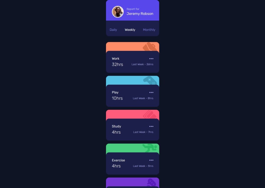
First and foremost - I couldn't get my desktop design to work, because when using grid, I always ran into an issue with the card "cap" - the colorful part, which wasn't attached to the correct card. If I was to remake the project, I wouldn't create a separate div for the cap, which would solve the problem. I won't be remaking it now tho, so I'm posting it in mobile-only version.
And secondly, next time I won't be updating the whole cards container (when fetching data), because it makes a weird "animation" of all the cards disappearing and appearing again.
Community feedback
- @kanosayPosted about 2 months ago
- solution differ considerably from the design (only phone design)
- all in all good
0

Please log in to post a comment
Log in with GitHubJoin our Discord community
Join thousands of Frontend Mentor community members taking the challenges, sharing resources, helping each other, and chatting about all things front-end!
Join our Discord