Design comparison
SolutionDesign
Community feedback
- @HoaxilogPosted 5 months ago
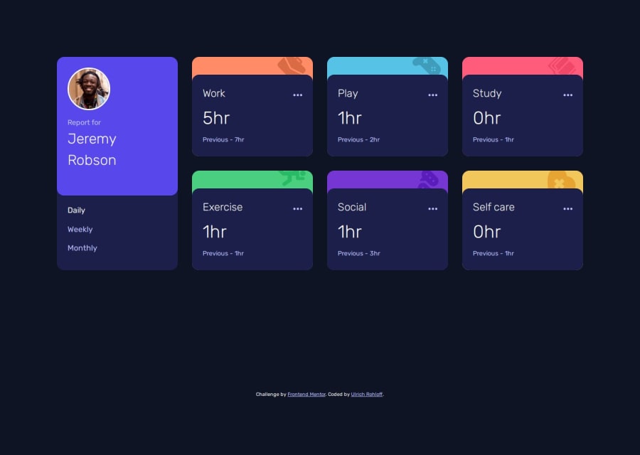
every grid item of yours after 760width is so stretch that there's a huge gap for every text form left to right. So for my opinion having huge gap on that is something I'm gonna change but overall it was so good especially how fluid it was when trying to check the responsiveness.
0
Please log in to post a comment
Log in with GitHubJoin our Discord community
Join thousands of Frontend Mentor community members taking the challenges, sharing resources, helping each other, and chatting about all things front-end!
Join our Discord
