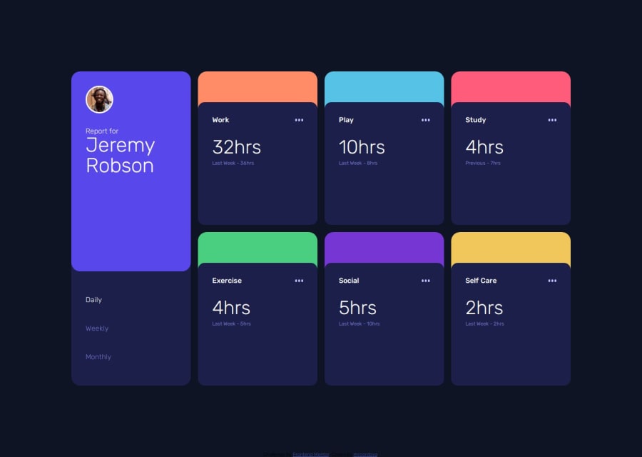
Time Tracking Dashboard Main using CSS Grid and Flexbox
Design comparison
Solution retrospective
I was able of figure out on how to layout the cards with CSS Grid. Next time, I would do more planning instead of going right into working on the project.
What challenges did you encounter, and how did you overcome them?I wasn't sure how to make CSS grid responsive and how to set the size for the cards and making their sizes responsive. I figured out using minmax(auto-fill, min(14rem, 100%)) made the sizes responsive. If there is a simpler way, please let me know.
Any general feedback is welcomed but I would like help using CSS Grid. I originally tried using grid on the cards on themselves but I couldn't figure how to lay them out and how to make them responsive so I ended up adding a couple of divs and made them Flexbox. So if this can be done with grid please let me know how or if grid was even needed.
Community feedback
- @JunbolPosted 6 months ago
Hi MR , nice work! Yes Grid is really complex and also responsive design. i usually only use grid for Desktop Layout for mobiles straight Flexbox is less complex. Saludos Junier
0
Please log in to post a comment
Log in with GitHubJoin our Discord community
Join thousands of Frontend Mentor community members taking the challenges, sharing resources, helping each other, and chatting about all things front-end!
Join our Discord
