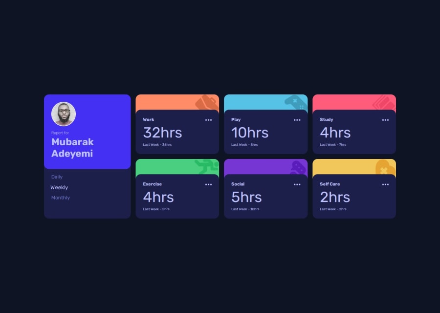
Design comparison
SolutionDesign
Solution retrospective
What are you most proud of, and what would you do differently next time?
I’m most proud of implementing a fully responsive design and using CSS Grid effectively to create a clean, organized layout. Next time, I’d focus on optimizing JavaScript for better performance and explore adding more interactivity, such as allowing users to customize their tracked activities.
What challenges did you encounter, and how did you overcome them?I found it difficult to arrange the cards in the desktop view while ensuring smooth accessibility and optimizing SEO. I strictly adhered to semantic tags and ARIA labels. To overcome this challenge, I wrapped all the elements in a container, allowing for better structuring and layout management.
Community feedback
Please log in to post a comment
Log in with GitHubJoin our Discord community
Join thousands of Frontend Mentor community members taking the challenges, sharing resources, helping each other, and chatting about all things front-end!
Join our Discord
