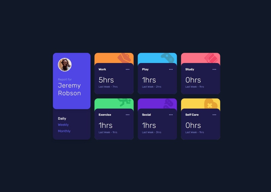
Design comparison
SolutionDesign
Solution retrospective
What are you most proud of, and what would you do differently next time?
create layout with grid with tailwindCSS, next time should minimize the component as current Card.jsx take the job of rendering, should use Card for layout only and render in Profile.jsx
What challenges did you encounter, and how did you overcome them?use grid for the layout as i render data inside Cards.jsx so i have to cut the Profile.jsx into 25% | 75% then inside Cards.jsx cut into 25% | 25% | 25%, i don't think this is good practice
What specific areas of your project would you like help with?better way to plan the layout before start writing code
Please log in to post a comment
Log in with GitHubCommunity feedback
No feedback yet. Be the first to give feedback on anderu's solution.
Join our Discord community
Join thousands of Frontend Mentor community members taking the challenges, sharing resources, helping each other, and chatting about all things front-end!
Join our Discord
