Submitted 2 months ago
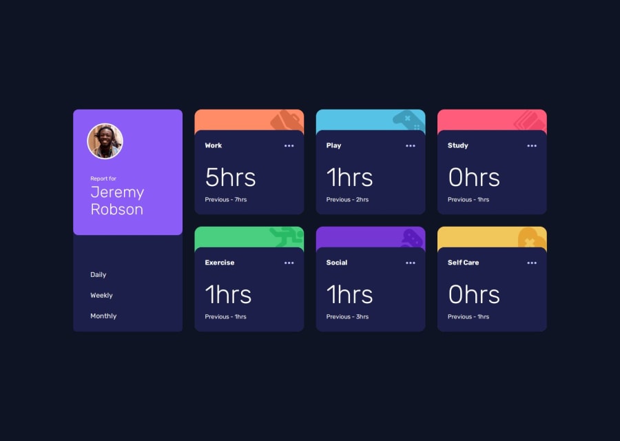
Time tracking dashboard
#vue#animation
@VincenzoMarcovecchio
Design comparison
SolutionDesign
Solution retrospective
What are you most proud of, and what would you do differently next time?
I would do different the tablet version
What specific areas of your project would you like help with?I made a lot of errors but the overall solution looks decent
Community feedback
- @wotanutPosted 2 months ago
This is an amazing solution, well done. The animated fly-in's are awesome. Here's a few tips to improve:
- Try putting your javascript in a seperate file to make your code easier to read
- Add more of a border radius around the report for card to be consistent with the rest of the border radiuses
- It isn't clear what the active state is (weekly, monthly, daily), try adding a hover effect so that it's clearer
Overall, this is an exemplary solution, well done.
1
Please log in to post a comment
Log in with GitHubJoin our Discord community
Join thousands of Frontend Mentor community members taking the challenges, sharing resources, helping each other, and chatting about all things front-end!
Join our Discord
