Design comparison
Solution retrospective
I created this challenge to get some practice on a relatively simple layout, given that I went for a few weeks without touching any code. Overall I'm satisfied with how the result is, there shouldn't be any errors, hey.. there's always more to learn!
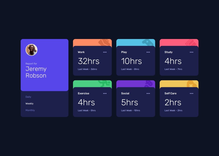
What challenges did you encounter, and how did you overcome them?I have not encountered any particular difficulties or problems in the implementation; the only thing I had to change at a certain point was the way I overlaid the cards (the dark blue area with the information on the activities) compared to the colored area with the appropriate icon.
If I tried to overlap them, you could see (especially in the edges) some pixels of the underlying color compared to the dark blue of the foreground.
What specific areas of your project would you like help with?If you like, you could give me some feedback about the way I built the layout, especially how I created the individual cards, and maybe about the Javascript code (even though it's quite simple) you might have found a more streamlined solution than mine... I I'm here, we could discuss it ;)
Community feedback
Please log in to post a comment
Log in with GitHubJoin our Discord community
Join thousands of Frontend Mentor community members taking the challenges, sharing resources, helping each other, and chatting about all things front-end!
Join our Discord
