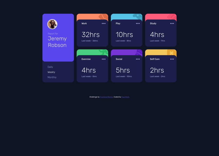
Design comparison
Solution retrospective
I'd like to know how to make the grid take up a larger section of the screen in the desktop view. Right now, it seems like the grid looks a little small and has a lot of space on the left and right margins.
I'd also like to know if there is a way to make the profile picture look higher resolution. I think it looks kind of pixely right now. Maybe it's possible to use an anti-aliasing or smoothing property in CSS to do this?
I'd be happy to hear any suggestions about how to improve this project. I know an easy one would be to have more organized code. If you look at the code, everything has been pretty much hacked together. It seems to display correctly, at least on my end, but the CSS is a horrible frankenstein mess.
Community feedback
- @Kamasah-DicksonPosted over 2 years ago
So first of all your dashboard is not properly centered. You can use
-
Display flex, align Items center on the body to center it but dont remove the min height. or
-
Display grid, align content center on the body. Dont remove the height on the body also.
-
Also you can use a max width on your dashboard to determine the maximum width you want you dashboard to have.
Note there is a difference between max width and width
I really like your solution on mobile it looks so good.
Besides your solution looks great👍 Good job there, keep coding👍
Marked as helpful1@pmork7Posted over 2 years ago@Kamasah-Dickson
Thanks for the feedback Kamasah! Much appreciated. This is exactly the advice I was hoping to get.
0@Kamasah-DicksonPosted over 2 years agoAm glad to hear that @pmork7 You are always welcome👍👍
0 -
Please log in to post a comment
Log in with GitHubJoin our Discord community
Join thousands of Frontend Mentor community members taking the challenges, sharing resources, helping each other, and chatting about all things front-end!
Join our Discord
