

Design comparison

Solution retrospective
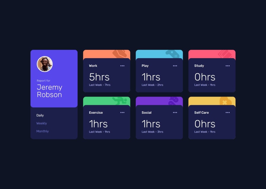
Getting the automatic card generation via .map of the array. I wanted to have the buttons for timeframes be automatically generated based on the data received too, but I had issues reading out the keys properly and decided not to invest too much time into it.
What challenges did you encounter, and how did you overcome them?Getting the grid to look right while having a presentable tablet version. For that I limited the max columns on the grid to 4 and manually adjusted the width of my columns to match mobile/pc sizes respectively.
Getting the position right on the background icons of the colorstrips seemes to be a bit of a magic number thing for me where I just used some % values for mobile/pc to make it look right.
All in all quite a lot of media queries here.
What specific areas of your project would you like help with?For some reason htmlPurge from vite-plugin-purgecss purges my second data on my cards [data-category]. What causes this to happen and how do I address this? I just removed PurgeCss to get my code to work in production, but this is not a good long-term solution.
Community feedback
Please log in to post a comment
Log in with GitHubJoin our Discord community
Join thousands of Frontend Mentor community members taking the challenges, sharing resources, helping each other, and chatting about all things front-end!
Join our Discord