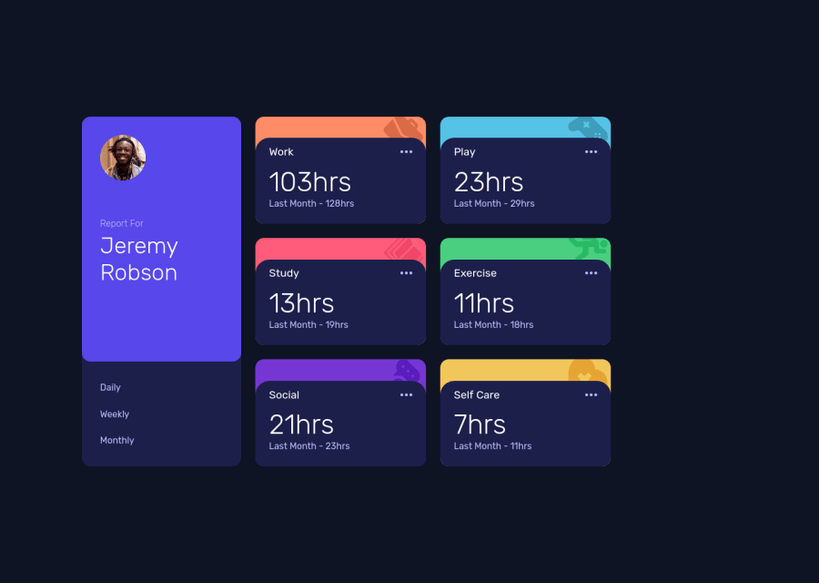
Time tracking dashboard built with Reactjs and Sass


Design comparison

Solution retrospective
Happy to receive feedback from all of you.😃
Community feedback
- @isprutfromuaPosted over 2 years ago
Hi there. You did a good job 😎
keep improving your programming skills🛠️
your solution looks great, however, if you want to improve it, you can follow these steps:
✅ don't repeat styles
.timeCards_container{
  width: 65vw;
  height: 60%;
  margin: auto;<--------
  display: grid;<--------
  grid-template-columns: repeat(auto-fill, 300px) ;
  grid-template-rows: repeat(2, auto);
  gap: 25px;
}
@media screen and (max-width:1040px){
  .timeCards_container{
    width: 60vw;
    height: 90%;
    margin: auto; <--------
    display: grid; <--------
    grid-template-columns: repeat(auto-fill, 350px) ;
    grid-template-rows: repeat(6, 200px);
    gap: 25px;
  }
}
  .timeCards_container{
    width: 80vw;
    height: fit-content;
    margin: auto; <--------
    display: grid;   <--------
    grid-template-rows: repeat(6, 200px) ;
    grid-template-columns: 100%;
    gap: 25px;

  }
✅ Disallow css fonts @import. CSS font @import prevents parallel downloads, use <link> instead.
✅ use style linter. you use a very large number of nesting. this makes your code very fragile. in this case it is better to use scoped styles
I hope my feedback will be helpful. You can mark it as useful if so 👍 it is not difficult for you, but I understand that my efforts have been appreciated
Good luck and fun coding 🤝⌨️
Marked as helpful0

Please log in to post a comment
Log in with GitHub
Join our Discord community
Join thousands of Frontend Mentor community members taking the challenges, sharing resources, helping each other, and chatting about all things front-end!
Join our Discord