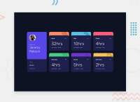
Design comparison
Solution retrospective
Hi,
Any feedbacks are welcomed! I had fun doing this challenge and it's my second project that I use Grid. It's also my first time to apply fetching to a real exercise.
Community feedback
- @ApplePieGiraffePosted over 2 years ago
Hey, Sang Le! 👋
Nice work on this challenge! 🙌 Your solution looks pretty good and is responsive! 😀
I'd like to suggest using interactive elements such as buttons or links for anything on the page that is clickable. Currently, everything on the page is a
divorp(which may work, but isn't great in terms of accessibility and semantics). I think most of the clickable elements in this challenge can at least be buttons. 😉This will increase the accessibility of your page, which means more people will be able to use and enjoy it, and you site will do better in things like SEO. 🥳
Keep coding (and happy coding, too)! 😁
Marked as helpful0@sqle157Posted over 2 years ago@ApplePieGiraffe Thank you for your feedback! I will take note of this for my next project
1
Please log in to post a comment
Log in with GitHubJoin our Discord community
Join thousands of Frontend Mentor community members taking the challenges, sharing resources, helping each other, and chatting about all things front-end!
Join our Discord

