Design comparison
Solution retrospective
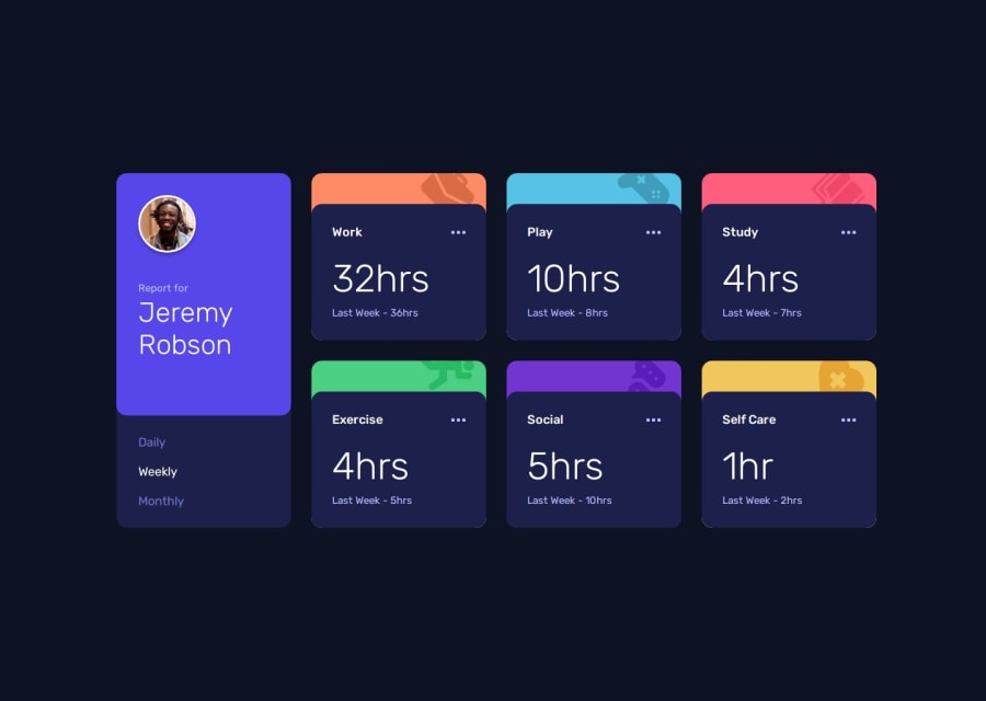
Happy with the layout. Next time I might add some subtle animations.
What challenges did you encounter, and how did you overcome them?For a while I wasn't sure how to go about the HTML for best semantics and to provide easy "hooks" for the CSS and JS. I looked around at what other people had done in similar situations, read some guides, and worked with ChatGPT.
What specific areas of your project would you like help with?Open to feedback for any improvements!
Community feedback
- P@DrakeHermitPosted 9 months ago
Your solution looks great to be honest, but I see that the area where your icons are is protruding through the main card. Also I noticed that in your JS you didn't include the JSON data file which means that you had to manually code everything and then enable or disable the hidden class. I personally wouldn't do it that way since this was a perfect challenge to practice your JSON data retrieval which is a crucial part in front end development.
But hey I'm a beginner too I can't judge too hard, we all have reasons why we do something differently.
0
Please log in to post a comment
Log in with GitHubJoin our Discord community
Join thousands of Frontend Mentor community members taking the challenges, sharing resources, helping each other, and chatting about all things front-end!
Join our Discord
