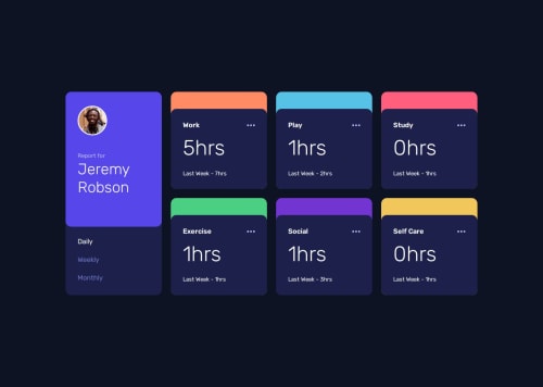
Submitted about 1 year agoA solution to the Time tracking dashboard challenge
Time tracking dashboard
react
@cacesasa

Solution retrospective
What are you most proud of, and what would you do differently next time?
I'm happy on how I completed the challenge and with the final result. Using React made the precess simpler with the use of components.
What challenges did you encounter, and how did you overcome them?The use of flex and grid container made the challenge simpler and challenge free.
What specific areas of your project would you like help with?As always, feedback is always welcome, if you see any area that can be improved please let me know.
Code
Loading...
Please log in to post a comment
Log in with GitHubCommunity feedback
No feedback yet. Be the first to give feedback on Carlos Santana's solution.
Join our Discord community
Join thousands of Frontend Mentor community members taking the challenges, sharing resources, helping each other, and chatting about all things front-end!
Join our Discord