

Design comparison

Solution retrospective
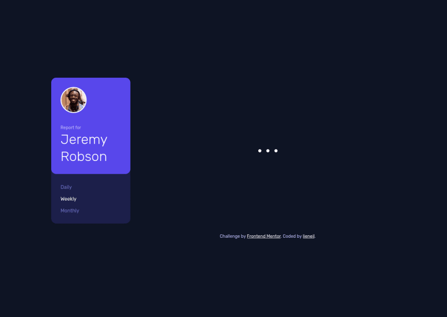
Instead of changing the text of every timecard, what I have done is just create a new card element and append it inside the container. By doing this, I can simply add a new activity, such as Sleep, to the data.json file, and it will automatically add a new card inside the html; while I still need to add a new card theme for background color and for the icon, I believe this is easier than modifying the html file everytime Ill add new activity.
I actually struggle more with CSS than with Javascript but overall this is a fun project and I enjoy it.
If you have any suggestions or feedback, please leave a comment down below. It really helps. Thanks
Please log in to post a comment
Log in with GitHubCommunity feedback
- @Yemisrach15
Hi Lieneil, I like your approach of reusing cards. Your js code is well commented and clear too. A couple of suggestions,
- The links imo should be buttons since they don't direct to another page.
- For tablet size (768px), the sidebar (
.header-container) would look better if it's at the top as the mobile version. You should also add space at the top between the content and the viewport edge. - There should only be one
h1within a document. - Buttons without text should also be accessible to screen readers. So you should add an
aria-label. - Some work is left regarding the semantics of the HTML. I see a lot of
divs :)
I can't comment on your scss because I haven't tried what you've used. Good job!

Join our Discord community
Join thousands of Frontend Mentor community members taking the challenges, sharing resources, helping each other, and chatting about all things front-end!
Join our Discord