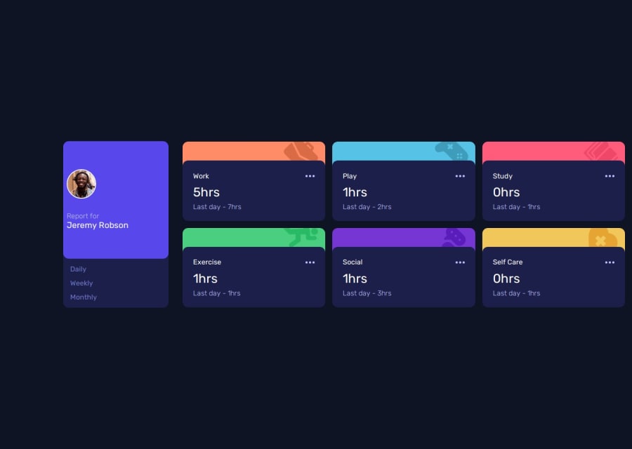
Design comparison
Community feedback
- @khatri2002Posted about 2 months ago
Hi @cas1092!
The developed solution looks good! Below are some suggestions for improvement:
1) Proper Center Alignment of the Component
The component needs to be center-aligned as per the design reference. You've applied margin-based centering with:
main {
    margin: 0 10%;
}
This only adds space on the left and right but doesn’t truly center the component. If the viewport size changes, the alignment might not be consistent.
Improved Approach: Use Flexbox for Centering:
Instead of margin-based centering, make the body a flex container and center-align themainelement dynamically:body { display: flex; flex-direction: column; align-items: center; justify-content: center; }Now, you can remove the margin from
main. This method is more responsive and dynamic.2) Use
buttonInstead ofafor UI InteractionsYou’re using an
<a>element for "Daily," "Weekly," and "Monthly" options while handling the click event.<a>is meant for navigation, and clicking it suggests a page redirection. In your case, clicking the element updates the UI without navigation, which means a<button>is more appropriate.
Semantic HTML matters! Use<button>to represent interactive UI actions.Accessibility & Usability Benefits:
- Buttons are keyboard-friendly by default.
- They provide better semantics for screen readers.
3) Ensure Consistent Card Spacing
The spacing between the cards is inconsistent compared to the design reference.
This happens because:- The
main_containerflex-box has agap: 1rem;✅ - The
cards_containergrid also has agap: 1rem;✅ - BUT, the
cards_containeralso has extra padding, which increases the spacing. ❌
Remove Unnecessary Padding
Instead of using both gap and padding, remove the padding and rely entirely ongap:Bonus Tip:
- Define a CSS variable for consistent spacing:
:root {
    --card-spacing: 1rem;
}
Now, apply it to both the grid and flexbox:
.main_container {
    display: flex;
    gap: var(--card-spacing);
}

.cards_container {
    display: grid;
    gap: var(--card-spacing);
}
Why is this better?
- Maintains consistent gaps across components
- Easier to update in the future
- Avoids layout inconsistencies
Great job so far! Keep up the amazing work! 🚀
0
Please log in to post a comment
Log in with GitHubJoin our Discord community
Join thousands of Frontend Mentor community members taking the challenges, sharing resources, helping each other, and chatting about all things front-end!
Join our Discord
