

Design comparison
SolutionDesign

Community feedback
- @artemkotko14Posted about 2 months ago
Great job with completing this challange!!! I like your design and your responsiveness is also great.
A few minor suggestions:
- You can add focus states to your buttons for better UI.
- Also you forgot to change a color for a button when it's on hover.
- I can also recommend you to use hgroup element for better semantic htmnl instead of plain divs here:
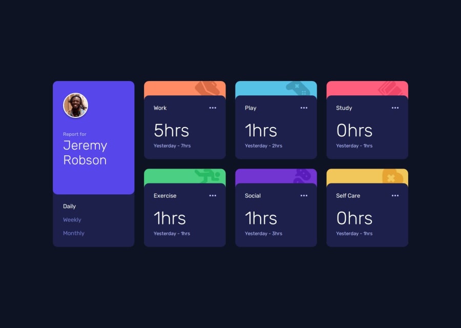
        <hgroup>
          <p>Report for</p>
          <h2>Jeremy Robson</h2>
        </hgroup>
Keep on coding!
Marked as helpful0

Please log in to post a comment
Log in with GitHubJoin our Discord community
Join thousands of Frontend Mentor community members taking the challenges, sharing resources, helping each other, and chatting about all things front-end!
Join our Discord