Design comparison
Community feedback
- @Smart-Ace-DesignsPosted 2 months ago
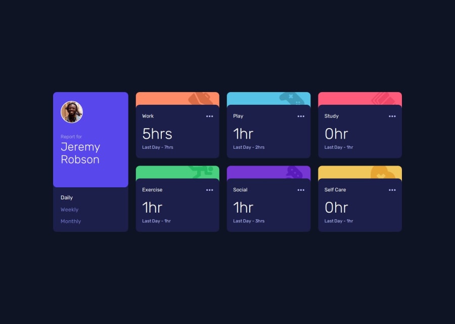
This looks excellent. I did not see any issues with it other than when you click daily it should say "Yesterday" or monthly it should say "Last Month". Currently is says "Last Week" for all three (although your screenshot seems to be somewhat correct - it shows "Last Day" for daily - but the live web still shows "Last Week).
The responsiveness look correct at all screen sizes. I like the added touch of changing the colors of the cards on hover.
Overall a very good design and recreation of the specifications.
Marked as helpful0@FaojulazimPosted 2 months ago@Smart-Ace-Designs Thanks for noticing this. Seems like I forgot to change the daily, weekly and monthly tabs status. Appreciate you getting in touch with me for this typo. Happy coding!
1
Please log in to post a comment
Log in with GitHubJoin our Discord community
Join thousands of Frontend Mentor community members taking the challenges, sharing resources, helping each other, and chatting about all things front-end!
Join our Discord
