Design comparison
Community feedback
- P@elisilkPosted 7 months ago
Hi 👋 @KMS56135,
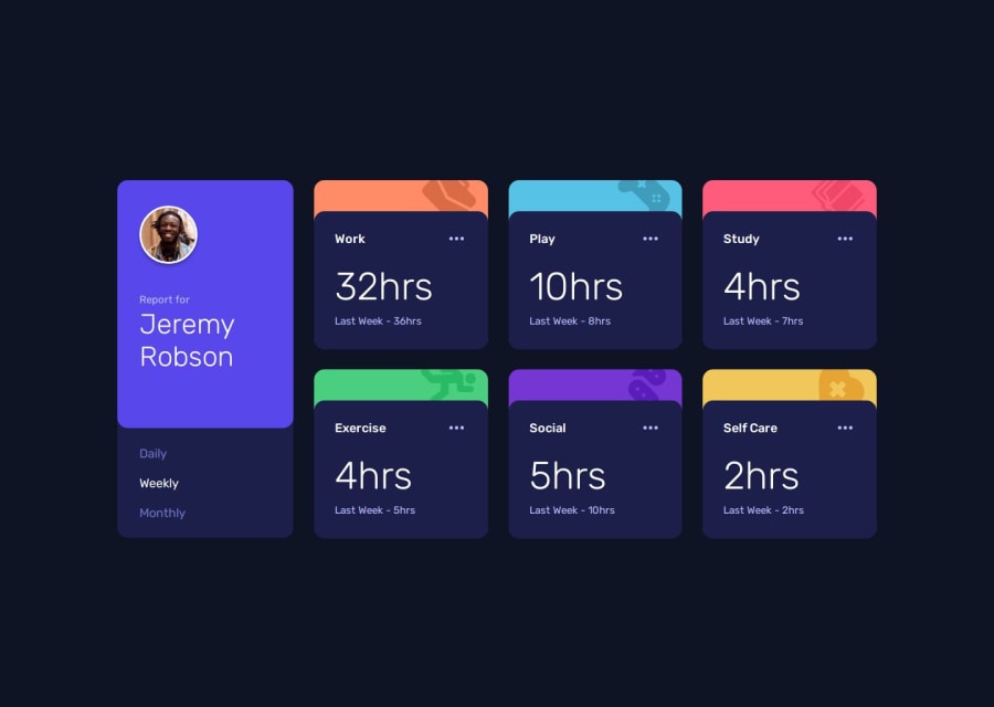
Congrats on a great solution. 👏 It looks almost exactly like the design.
When you are ready to dive in further 🤿, I'd suggest a few things related to how the solution works at viewport widths between 1440px and 375px.
First, when I tested your solution out, I noticed first that at 375px, your solution's height can go beyond the viewport height and so is off the screen (at least for my smaller screen 📺). I'd suggest in your
dashboardclass, changing theheight: 100vh;attribute tomin-height: 100vh;instead. That way the container fills the entire viewport, but is not prevented from scrolling.Second, testing out your solution at around a viewport width of 940px or so, it starts to get cramped and extends beyond the viewport (without scrolling). And then it continues to get more cramped until it switches over to one big column at 375px (as in the design). I can imagine different approaches to handle this kind of thing. Although maybe not the most flexible solution, adding a couple more breakpoints with media queries would be relatively simple to do. For example, you could move your
dashboardcontainer down to one column sooner (while keeping thestats-gridas is), so that the profile and time periods are on top but the stats grid stays at 3x3. Alternatively, you could move thestats-grid__innerdown to two columns (from 3) earlier and keep the profile on the left for a little longer. Or do some combination of those two moves before you finally get down to one full column for the whole dashboard. To facilitate this, I'd suggest removing from the.dashboardclass the attributegrid-template-rows: 518px;so that your dashboard is free to extend further in the vertical direction.Anyway, just something to consider if you are thinking about improving on this solution. 🤔
Happy coding. 💻
Eli
Marked as helpful0
Please log in to post a comment
Log in with GitHubJoin our Discord community
Join thousands of Frontend Mentor community members taking the challenges, sharing resources, helping each other, and chatting about all things front-end!
Join our Discord
