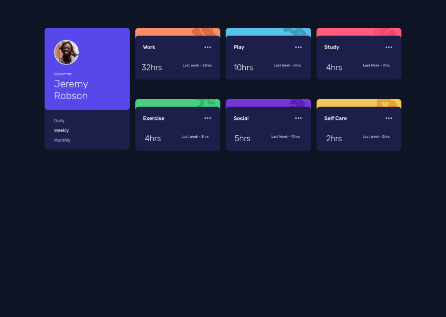
Design comparison
Solution retrospective
The background color for the small activity images doesn't appear on the phone, but when I simulated phone sizes on my laptop, it was right there. Please how do I solve this?
Community feedback
- @catherineisonlinePosted almost 2 years ago
Nice! 🙌🏻
I would also add some transitions for active states (when colors change on hover). It creates more interactivity and makes the project looks cooler. Active states can be done on buttons, links, titles which act like links or anything else, you choose.
You can read more about it here, in case you haven’t done much of it: https://www.w3schools.com/css/css3_transitions.asp
IF THIS WAS HELPFUL PLEASE MARK IT AS HELPFUL 🤩
Marked as helpful0@raphaelnnadiPosted almost 2 years ago@catherineisonline thank you so much catherine
0
Please log in to post a comment
Log in with GitHubJoin our Discord community
Join thousands of Frontend Mentor community members taking the challenges, sharing resources, helping each other, and chatting about all things front-end!
Join our Discord
