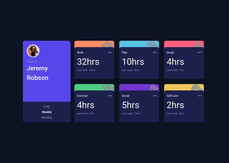


Design comparison

Solution retrospective
I'm most proud of the project's overall responsiveness and how it adapts gracefully across various breakpoints. Leveraging Tailwind's spacing scale and utility classes allowed us to create a clean, maintainable design that works consistently on mobile, tablet, and desktop. It was rewarding to see the layout transition smoothly between flex directions and grid configurations.
If I were to do it differently next time, I would invest more time into creating custom breakpoints and possibly a design system for even more granular control over the UI. I might also integrate more advanced state management or even animation libraries to enhance user interactions further. This experience reinforced the importance of flexibility and planning for responsive design from the start.
What challenges did you encounter, and how did you overcome them?One of the main challenges was ensuring that the layout remained fluid and centered across a wide range of screen sizes. Initially, the flex direction and absolute positioning of certain elements (like the timeframe buttons) caused the content to shift or get clipped at specific breakpoints. To overcome this, I revisited the responsive classes in Tailwind and adjusted the breakpoints, using a mix of flex and grid utilities to ensure that the design gracefully transitions from a column to a row layout. This helped maintain a centered and cohesive look regardless of screen size.
Another challenge was fine-tuning the dynamic sizing of components. It took some trial and error to set up the spacing scale so that the user profile and activity cards scaled proportionally on different devices. Leveraging Tailwind’s utility classes for width, height, and spacing allowed for quick adjustments until the desired responsiveness was achieved.
Overall, the process reinforced the importance of responsive design and iterative testing across multiple breakpoints. Each issue provided an opportunity to learn more about Tailwind's responsive utilities and how to apply them effectively in a real-world project.
What specific areas of your project would you like help with?Responsive Design Refinement: I'm looking to further optimize the responsiveness of the dashboard. Although it adapts well across breakpoints, I'd like suggestions on any potential tweaks or best practices to ensure consistency and optimal spacing on unusual screen sizes.
Component Abstraction & Reusability: I want to ensure that my components (like UserProfile, ActivityCard, and ActivityGrid) are as reusable and maintainable as possible. Any insights on abstraction, code splitting, or better state management would be very helpful.
Performance Optimization: Since the layout involves dynamic image rendering and responsive adjustments, I'm curious about techniques or tools that could help with performance improvements, especially for mobile devices.
Enhanced Interactivity & User Experience: While the basic interactions work fine, I'm looking for ideas on how to introduce more advanced animations or transitions that could make the dashboard feel even more engaging.
Community feedback
- @barcacaPosted about 2 months ago
The site looks good, but you need to adjust the font sizes for other breakpoints and use the challenge's font to make it perfect.
Marked as helpful0

Please log in to post a comment
Log in with GitHub
Join our Discord community
Join thousands of Frontend Mentor community members taking the challenges, sharing resources, helping each other, and chatting about all things front-end!
Join our Discord