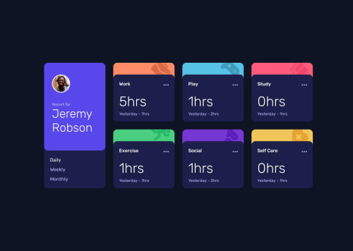
Submitted about 1 year agoA solution to the Time tracking dashboard challenge
Time Tracking Dashboard
sass/scss
@victorsobrinho93

Solution retrospective
What are you most proud of, and what would you do differently next time?
What would I do differently
Improve on the responsiveness as the layout is a little "rigid" in the halfway point between landscape fullscreen and portrait.
Clean up the js a little. Maybe cut down a couple steps here and there. I'm not too sure I've been following best practices.
Code
Loading...
Please log in to post a comment
Log in with GitHubCommunity feedback
No feedback yet. Be the first to give feedback on Victor Sobrinho's solution.
Join our Discord community
Join thousands of Frontend Mentor community members taking the challenges, sharing resources, helping each other, and chatting about all things front-end!
Join our Discord