Design comparison
SolutionDesign
Community feedback
- @aouintihouariPosted about 2 months ago
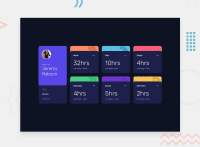
Good job, but the components that blink each time one hovers over are a little bit ugly; they should keep the light background until one leaves. Also, the "last week" part doesn't update, and in small screens, the activities are stacked one over the other; a
margin-bottom: 1rem;could fix this. Over all, you did a good job, and all these problems can be solved easily.0
Please log in to post a comment
Log in with GitHubJoin our Discord community
Join thousands of Frontend Mentor community members taking the challenges, sharing resources, helping each other, and chatting about all things front-end!
Join our Discord

