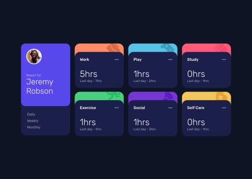
Design comparison
Solution retrospective
A have a little problem in the bottom borders of the cards. I think i know the solution but maybe its not the best. Anything is welcome. :))
Community feedback
- @jasonameyPosted over 2 years ago
Hi Murillo!
Ugh, yeah this was frustrating... took me a few minutes to figure this out..
I was able to solve the border issue by making sure the two cards had separate bottoms. That is, their bottoms are not directly over each other, on the same floor line.
It looks like this is common bug - that is, the faint, 1px-ish border radius peeking out.
I think you would have to change your HTML so the elements are side by side - not parent / child.
like :
<div class="card-1></div> <div class="card-2></div>not :
<div class="card-1> <div class="card-2></div> </div>There are a few ways you could do this then with top, and absolute positioning... I think you could do it with margin, too.
I made an illustration of the issue :
https://docs.google.com/drawings/d/1YNGJR3bJoScawivYbi3P5tCoTGCweDuQdpCmb-y39lM/edit
I was able to do this by creating another container (maybe too many div's ?)...
https://codepen.io/jasonamey/pen/MWQREgG
Might be other ways to do it! That's what I came up with!
0@MuriWolfPosted over 2 years ago@jasonamey Hey dude, thanks for your reply!
I did this, what do you think?
<div class="div1"> <div class="div2"><div2> <div1>CSS: .div1 { ...; position: relative; } .div2 { ...; position: absolute; bottom: -4px; }
1@jasonameyPosted over 2 years ago@MuriWolf yeah that idea is super simple / elegant... really good (!)
0
Please log in to post a comment
Log in with GitHubJoin our Discord community
Join thousands of Frontend Mentor community members taking the challenges, sharing resources, helping each other, and chatting about all things front-end!
Join our Discord