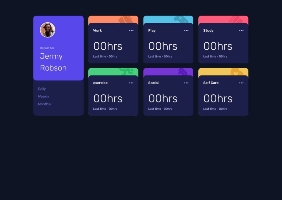
Design comparison
Solution retrospective
Most proud of: I learned how to use the old way (XML) and the new way (fetch).
Do differently: Create a loading spinner.
What challenges did you encounter, and how did you overcome them?None
What specific areas of your project would you like help with?None, but I welcome any comments and hints.
Community feedback
- P@TemceoPosted 10 months ago
Hi, good effort.
One recommendation for improvement is in the media query. It stays in mobile design until 1000px. You can use css grid auto-fit / minmax to create a responsive layout at all screen sizes. This article from css tricks gives a good demonstration of how this works.Marked as helpful1
Please log in to post a comment
Log in with GitHubJoin our Discord community
Join thousands of Frontend Mentor community members taking the challenges, sharing resources, helping each other, and chatting about all things front-end!
Join our Discord
