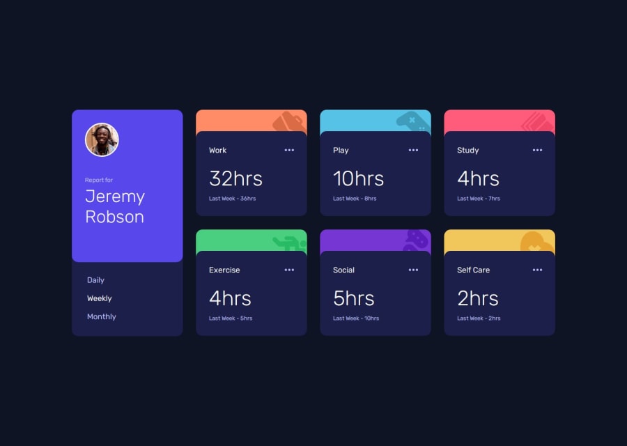
Design comparison
Solution retrospective
Having a grid of six similar cards, it was very satisfying to set properties and watch all update uniformly at the same time. Cascading felt very elegant.
I didn't invest much time getting the aesthetics picture perfect, as I find the trial-and-error time-consuming without much learning benefit. For example, I didn't bother to align the category icons per preview.
What challenges did you encounter, and how did you overcome them?I hit a roadblock highlighting active state for the text to select timeframe. My JS function resets all colours back to the default colour, before highlighting the active timeframe. But, because I set properties directly, specificity was greater, so onhover didn't play nicely with active. As a fix, the JS adds/removes a highlight class rather than sets properties directly, making all highlighting operate on the same level.
The fetch URL to JSON file worked fine in localhost, but was hitting a 404 on GitHub. To move up one folder, I used ./ rather than ../ - I don't know why this worked, but I saw another student do it, and it works.
For highlighting the ellipse, I simply made a copy of the SVG and changed fill colour to white. So hover changes from blue ellipse to white ellipse. I'm very tired of working with SVG fill properties, so happy to have this workaround.
What specific areas of your project would you like help with?I'm very keen to see other solutions. I suspect my code is overly-verbose from being new to many of these problems.
For positioning the colored strips overlapping the content, my properties became very pixel-perfect rather than intrinsic.
My JS also selects every timefield using its' own individual ID. So I have 15 lines of just .getElementById. I wonder if there's a more elegant way to map ID to variables.
Join our Discord community
Join thousands of Frontend Mentor community members taking the challenges, sharing resources, helping each other, and chatting about all things front-end!
Join our Discord
