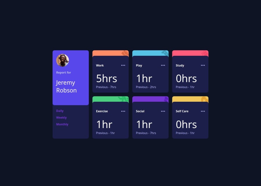


Design comparison

Community feedback
- @khatri2002Posted 3 months ago
Hi! The developed solution looks good!
The breakpoints are handled very well, and the component is responsive! However, take note that in the mobile resolution, a few elements' positions are not aligned with the given design reference for smaller-width devices. For example:
The current value and the previous value should be displayed side by side (row layout) in the mobile resolution and in a column layout for the desktop resolution. While the desktop resolution is aligned correctly, the column layout is not switching to row layout in the mobile view.
In case you need guidance, here's one way to handle this:
- Wrap the two elements (current and previous values) that need to change their layout in a
divstyled as a flexbox. - Assign
flex-direction: column;to ensure the elements are in a column layout. - At a specific breakpoint (e.g., for smaller-width devices), update the
flex-directiontorow. This ensures the elements are side by side in the mobile resolution.
This is just one approach to handle the issue.
Great job so far! Keep up the good work! 🚀
Marked as helpful0 - Wrap the two elements (current and previous values) that need to change their layout in a

Please log in to post a comment
Log in with GitHub
Join our Discord community
Join thousands of Frontend Mentor community members taking the challenges, sharing resources, helping each other, and chatting about all things front-end!
Join our Discord