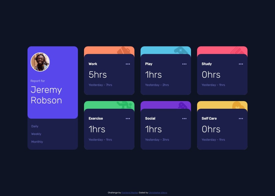
Design comparison
Solution retrospective
I struggled with designing the color icon tab that was underneath each section. My approach was to create to image with position: absolute inside of a position: relative container, but once I started adding in z-index values the stacking context got a little confusing to me so I'm curious how other people designed that portion. Also I have never worked with incorporating json data before so I'm interested in how other people approached that as my method feels a little clumsy to me and I think it could probably be handled more succinctly. Any feedback is greatly appreciated!
Community feedback
Please log in to post a comment
Log in with GitHubJoin our Discord community
Join thousands of Frontend Mentor community members taking the challenges, sharing resources, helping each other, and chatting about all things front-end!
Join our Discord
